People
The 'people' layout displays a list of persons with additional information. Typically, this layout is well suited for a people directory.
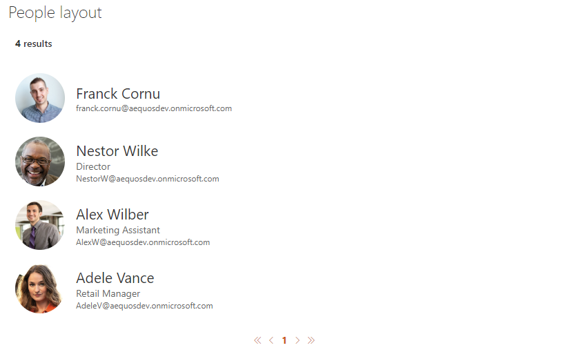
By default, the user profile pictures are fetched from the SharePoint User Profile Service. If your user pictures are stored in Active Directoy, make sure you synchronized them with SharePoint User Profile Service. Otherwise, a placeholder image will be displayed.
| Setting | Description | Default value |
|---|---|---|
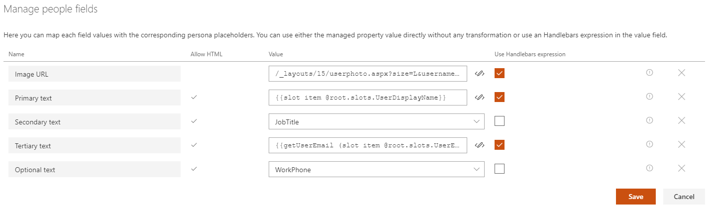
| Manage people fields | Allows you to define you own values for people placeholder fields.
@root.theme to use theme colors (ex: @root.theme.palette.themePrimary) or @root.slots.<SlotName> to access slot value. If you don't set a value for those fields (i.e an empty value), they won't appear in the UI.The UPN-field is necessary for displaying the native SharePoint persona card (LPC) on hover. If it contains an empty value, the persona card will not appear. If it contains an invalid value (e.g. a non-existing UPN), an empty persona card will be shown. |
|
| Show persona card on hover (LPC) | If enabled, show a person card on hover for the curren item using the native SharePoint implementation. | |
| Show persona card on hover | If enabled, show a person card on hover for the current item.
$m365 spo serviceprincipal grant add --resource '<aad_app_display_name>' --scope 'user_impersonation'. Refer to the section below about persona hover card customization. |
|
| Show presence | If enabled, the person's presence-information will be displayed in the bottom right corner of the user's profile picture. This feature uses Microsoft Graph and needs the API permission 'Presence.Read.All' in your tenant to work. |
|
| Show hover on picture only | If enabled, the person card (LPC) or the persona card will only appear when hovering over the profile picture, not the entire item. This provides a more focused hover experience and is useful for compact layouts. | |
| Component size | The size of the person item (not only the picture). The more the size is and the more information will be displayed for each item and vice versa. |
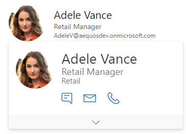
Persona hover card
Activating this option may slightly reduce loading performances because the user information are fecthed individually for each user (i.e result). This option shouldn't be used with large page count.
Microsoft Graph Toolkit
The hover card uses Microsoft Graph Toolkit. This means you can add additional information providing your own template like this:
 <mgt-person-card inherit-details>
    <template data-type="additional-details">
    <h3>Stuffed Animal Friends:</h3>
    <ul>
        <li>Giraffe</li>
        <li>lion</li>
        <li>Rabbit</li>
    </ul>
    </template>
</mgt-person-card>