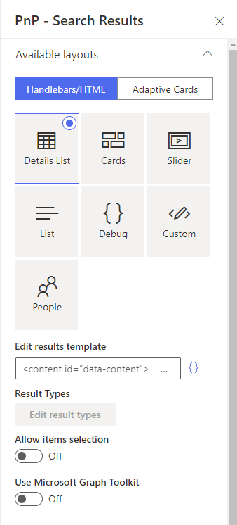
Customize layout templates
In a basic customization scenario, super users and webmasters can customize existing templates or start from a blank template to adapt the UI to their requirements. Templates can use either Handlebars or Adaptive cards templates to display data retrieved from the data source. Depending on the template type, there are several options to customize a template.
Template types
Handlebars
- Use regular HTML markup, Handlebars syntax and helpers.
- Write custom CSS styles.
Adaptive cards
- Use declarative Adaptive Cards JSON templates with data.
Both techniques
- Use data sources slots
- Use default web components provided by the solution.
- Use Microsoft Graph Toolkit components.
Handlebars, HTML and CSS customizations
The templates and fields HTML markup is sanitized automatically preventing XSS attacks. We use
DOMPurifyto do so. It means for instance, you cannot add your own<script>tags or inline JavaScript.
Blocked HTML elements
The following HTML elements are removed during sanitization because they have no legitimate use in search result templates and present security risks:
| Element | Reason |
|---|---|
<script> |
JavaScript execution |
<iframe> |
Arbitrary content embedding |
<form> |
action attribute accepts javascript: URIs |
<button> |
formaction attribute accepts javascript: URIs |
<object> |
Plugin execution, external resource loading |
<embed> |
Plugin execution, external resource loading |
Blocked HTML attributes
The following attributes are stripped from all elements to prevent JavaScript execution and data exfiltration:
| Attribute | Reason |
|---|---|
on* (onclick, onerror, etc.) |
Inline JavaScript execution |
action, formaction |
Accept javascript: URIs |
xlink:href |
SVG JavaScript execution via javascript: URIs |
srcdoc |
HTML/JavaScript injection |
ping |
Data exfiltration to external servers |
dynsrc, lowsrc, background |
Legacy attributes that accept javascript: URIs |
Allowed elements and attributes
Standard HTML elements for layout and presentation (<div>, <span>, <table>, <a>, <img>, <ul>, <li>, etc.) are allowed, along with:
<style>tags for custom CSS (CSS content is sanitized to block@import,javascript:, and similar vectors)<link rel="stylesheet">tags for same-origin stylesheets only (external domains are blocked)<content>tags for template structure- Custom web components (e.g.
<pnp-iconfile>,<my-component>) data-*attributes for custom component configurationstyleattributes (sanitized to remove dangerous CSS patterns)hrefon links (validated against an allowlist of safe URI schemes —javascript:is blocked)
Template structure
A layout template is always split into two distinct parts:
    <content id="template">
        <!-- Your template content here -->
    </content>

    <content id="placeholder">
        <!-- Your placeholder content here -->
    </content>
-
A
templatepart, containing the HTML markup to display your data once fetched. This part is mandatory to display your data. -
A
placeholderpart, containing the HTML markup to display as placeholder while the data are getting fetched. This part is optional.
Both can use Handlebars and web components (Microsoft Graph Toolkit included).
Handlebars helpers
The following custom helpers are available in addition to the handlebars-helpers. If those don't do the job for you, you can still write your own using the extensibility library.
The
markdownandlogginghelpers are not available. Fortimesusemultiplyastimesis a custom iterator.
dayDiff
Syntax {{dayDiff <date1> <date2>}}
Description Return the number of days between two dates, eg. show an icon for files created within the last 30 days.
Example {{#compare (dayDiff (getDate Created 'YYYY-MMM-DD' ) (getDate timestamp 'YYYY-MMM-DD' )) "<=" 30 }} <img src='/SiteAssets/New.png' />{{/compare}}
dayjs / moment
Syntax {{dayjs "<format>"}}, {{dayjs <date> "<format>"}}, or {{dayjs format="<format>"}} (same for moment)
Description Format dates using dayjs. The moment helper name is kept for backward compatibility. Both names are identical.
When the second positional argument is "X" or "x" and the first argument is numeric, it is treated as an input parsing hint ("X" = Unix seconds, "x" = Unix milliseconds) rather than an output format. To output Unix seconds/milliseconds from a date value, use the format hash argument instead: {{dayjs someDate format="X"}}.
{{dayjs "X"}}— current date as Unix seconds{{dayjs "2026-10-01" "LL"}}— parse date, format as locale date{{dayjs someDate "YYYY-MM-DD"}}— parse date value, custom format{{dayjs someDate "X"}}— format date as Unix seconds (non-numeric first arg = output format){{dayjs 1714400000 "X"}}— parse1714400000as Unix seconds (numeric first arg = input parsing){{dayjs someDate format="X"}}— format date as Unix seconds (explicit hash format){{dayjs format="LL" subtract="7 days"}}— 7 days ago, locale format
Supported output format tokens include all dayjs format tokens plus X (Unix seconds), x (Unix milliseconds), Do (ordinal day), Q (quarter), k/kk (hour 1-24), w/ww (locale week), W/WW (ISO week), e (locale weekday), E (ISO weekday), gg/gggg and GG/GGGG (week year).
Example {{dayjs "X"}} returns the current date as a Unix timestamp (seconds).
getAttachments
Syntax {{getAttachments}}
Description Return object structure for list item attachments.
Example {{#getAttachments LinkOfficeChild}}<a href="{{url}}">{{index}} - {{fileName}}</a>{{/getAttachments}}
getCountMessage
Syntax {{getCountMessage <total items count> <keywords>}}
Description Display a friendly message displaying the result and the entered keywords.
Example {{getCountMessage 5 "contoso"}} will display '5 results for 'contoso'.
getDate
Syntax {{getDate <data_value> "<format>" "<time handling>"}}
Description Format the date with dayjs (moment.js-compatible) according to the current language. Date in the managed property should be on the form 2018-09-10T06:29:25.0000000Z for the function to work. <time handling> is optional and takes:
- 0 = format to browsers time zone (default)
- 1 = ignore Z time and handle as browsers local time zone
- 2 = strip time and set to 00:00:00 in browsers local time zone
- 3 = display in the time zone for the current web
- 4 = display in the time zone from the user's profile
Example {{getDate 2018-09-10T06:29:25.0000000Z 'LL'}}
getGraphPreviewUrl
Syntax {{getGraphPreviewUrl "<absolute_URL>"}}
Description Try to determine the preview URL based on an absolute URL using the unified Microsoft Graph URL syntax. For instance, https://contoso.sharepoint.com/sites/dev/Shared%20Documents/MyDocument.pdf becomes https://contoso.sharepoint.com/sites/dev/Shared%20Documents/?id=/sites/dev/Shared%20Documents/MyDocument.pdf&parent=/sites/dev/Shared%20Documents
Example {{getGraphPreviewUrl "https://contoso.sharepoint.com/sites/dev/Shared%20Documents/MyDocument.pdf"}}
getPageContext
Syntax {{getPageContext "<SPFx page property>"}}
Description Retrieve a property from the SPFx context object.
Example {{getPageContext "user.displayName"}} or {{getPageContext "cultureInfo.currentUICultureName"}}
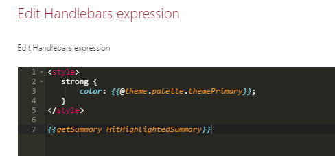
getSummary
Syntax {{getSummary "<value>"}}
Description Use with SharePoint Search data source and the HitHighlightedSummary SharePoint search managed property. Returns the formatted value for rendering.
Example {{getSummary "HitHighlightedSummary"}}
getTagName
Syntax {{getTagName "<value>"}}
Description Use with tag fields. Returns the name of the tag, omitting the ID in the tag string (L0\|#000000000-0000-0000-0000-000000000000\|…).
Example {{getTagName "Tag"}}
getUnique
Syntax {{getUnique items "<property>"}}
Description Return the unique values as a new array based on an array or property of an object in the array.
Example {{getUnique items "NewsCategory"}}
getUniqueCount
Syntax {{getUniqueCount items "<property>"}} or {{getUniqueCount array}}
Description Get the unique count of a property over the result set (or another array) or get the unique count of objects in an array. Example: [1,1,1,2,2,4] would return 3.
Example {{getUniqueCount [1,1,1,2,2,4]}}
getUrlField
Syntax {{getUrlField <managed_propertyOWSURLH> "URL|Title"}}
Description Use with SharePoint Search data source. Returns the URL or Title part of a URL auto-created managed property
Example {{getUrlField MyPropertyOWSURLH "Title"}}
getUrlParameter
Syntax {{getUrlParameter <parameter> <url>}}
Description Return the query parameter value from a URL. Omitting the optional url parameter uses the current browser URL.
Example {{getUrlParameter "k"}} return the value of the k query parameter from the browser URL. {{getUrlParameter "k" "https://foo?k=test"}} return the value of the k query parameter from the provided URL.
getUserEmail
Syntax {{getUserEmail <value>}}
Description Extract the user email in a string based on a email regex (ex: a claim). Returns the first match.
Example {{getUserEmail "franck.cornu@contoso.onmicrosoft.com | Franck Cornu | 693A30232E667C6D656D626572736869707C6672616E636B2E636F726E7540616571756F736465762E6F6E6D6963726F736F66742E636F6D i:0#.f|membership|franck.cornu@contoso.onmicrosoft.com"}}
#group
Syntax {{#group items by="<property>"}}
Description Group items by a specific results property. See https://github.com/shannonmoeller/handlebars-group-by for usage.
Example {{#group items by="RefinableString00"}}
regex
Syntax {{regex <expression> <string>}}
Description Run a regular expression and return the match. Return - if not match.
Example {{regex '\d+' 'digit 15 is a number'}} will return 15
slot
Syntax {{slot item <property_name>}}
Description Return the <property_name> value for the item object. Supports deep property paths.
Example {{slot item "property.subproperty"}}
stringToHex
Syntax {{stringToHex <value>}}
Description Convert a string value to a UTF-8 hexadecimal string. This is useful when you need to generate the encoded filter value used by the Search Filters deep-link format.
Example {{stringToHex "Keogh’s Crisps"}} returns 4b656f6768e280997320437269737073.
hexToString
Syntax {{hexToString <value>}}
Description Convert a UTF-8 hexadecimal string back to text. The helper also accepts the filter value format used in deep links, including optional surrounding quotes and the ǂǂ prefix.
Example {{hexToString '"ǂǂ4b656f6768e280997320437269737073"'}} returns Keogh’s Crisps.
formatSPFileSize
Syntax {{formatSPFileSize <value>}}
Description Formats a file size in bytes into a SharePoint-style value — bytes,
KB, MB, GB, or TB. Pass a numeric bytes value: map a managed property
holding the raw file size in bytes to a slot such as fileSizeBytes, then reference
that slot in your template.
Recommended source property: map a
RefinableIntfromOWS_FILESIZEDISPLAY. In testing this produced more accurate byte values — and therefore more accurate unit conversions — than theSizemanaged property, which can yield off-by-a-unit rounding at tier boundaries.The
TBtier is included for forward-compatibility: SharePoint Online's current maximum file size is 250 GB, soTBoutput is not reached in practice today, but the helper handles it should that limit rise.
Zero-byte, empty, invalid, negative, and non-integer values render as blank.
Example {{formatSPFileSize (slot item @root.slots.fileSizeBytes)}}
Representative examples:
| Input (bytes) | Output |
|---|---|
invalid (for example, abc) |
(blank) |
| 0 | (blank) |
| 500 | 500 bytes |
| 1023 | 1023 bytes |
| 1024 | 1 KB |
| 1048575 | 1.00 MB |
| 1048576 | 1 MB |
| 10485760 | 10 MB |
| 1073741823 | 1.00 GB |
| 1073741824 | 1 GB |
| 44398312377 | 41.3 GB |
Deep Link Example For Search Filters
If you want a value rendered in a custom results template to open a page with a filter already selected, you can build the filter payload yourself.
The deep-link query string parameter is f_<Search Filters instance ID>. The filter value must contain the UTF-8 hex form of the label, prefixed with ǂǂ and wrapped in escaped quotes.
{{!-- Example for a Search Filters web part whose instance ID is known --}}
{{!-- Replace the GUID below with the instance ID of your Search Filters web part --}}
<a
    href="/sites/contoso/SitePages/Search.aspx?f_4b43307b-8891-42d5-9a62-7bfb83c11de9=%5B%7B%22filterName%22%3A%22RefinableString109%22%2C%22values%22%3A%5B%7B%22name%22%3A%22{{slot item @root.slots.Title}}%22%2C%22value%22%3A%22%5C%22%C7%82%C7%82{{stringToHex (slot item @root.slots.Title)}}%5C%22%22%2C%22operator%22%3A0%2C%22disabled%22%3Afalse%7D%5D%2C%22operator%22%3A%22or%22%7D%5D"
>
    {{slot item @root.slots.Title}}
</a>
In practice, the safest approach is still to select a filter once in the UI, copy the generated URL, and then replace only the name and hex-encoded value parts in your template.
#times
Syntax {{#times <number>}}
Description Iterate the block <number> times.
Example {{#times 5}} some mark up {{/times}}
urlParse
Syntax {{urlParse <url>}}
Description Same as Handlebar Helpers. Omitting the optional url parameter uses the current browser URL.
Example {{get "query" (urlParse)}} return the query part of a URL
Need any other helper? Let us know here!
Using built-in web components
By default, several components are available (see the complete list). If these does not fit your requirement, you can still create your own using the extensibility library.
Custom CSS styles
Default Behavior
Inside an HTML template (or layout field), you can write your own CSS styles using a <style> tag. Even better, you can inject Handlebars variables, helpers, conditional blocks, etc. right inside it and get dynamic classes or attributes
<content id="data-content">
    <style>
        .example-themePrimary a {
            color: {{@root.theme.palette.themePrimary}};
        }
        ...
    </style>

    <div class="template">
        ...
    ...
However, all CSS rules (including @media rules) will be all prefixed automatically by an unique ID (pnp-template_<Web Part instance ID>) to make sure styles are isolated from other Web Parts on the page. We do this to avoid conflicts between classes in the global context.
Use of CSS Layers
In contrast to the automatically prefixing all styles with the web part instance ids, the style can live in its own so called layer. This way styles bleeding into the rest of the page can be avoided.
Layered styles - in contrast to the default behavior - allows mechanisms such as container queries and other future improvements such as CSS Nesting.
CSS support a mechanism for isolation CSS declarations in layers. To use this mechanism specify on the style tag the data property data-cssscope as layer.
<content id="data-content">
    <style data-cssscope="layer">
        .example-themePrimary a {
            color: {{@root.theme.palette.themePrimary}};
        }
        ...
    </style>

    <div class="template">
        ...
    ...
This convert the CSS into the following form:
    <style data-cssscope="layer">
    @layer {
        .example-themePrimary a {
            color: {{@root.theme.palette.themePrimary}};
        }

        ...
    }
    </style>
Browser support for CSS Layer on can-i-use.
Hide error message using CSS
By default the web parts will output an error message if something goes wrong on for example API calls.
If you want to hide the error message you can add the following CSS in your custom template.
<content id="data-content">

    <style>
        .pnpSearchResultsErrorMessage { display:none; }
        ...
    </style>

    <div class="template">
        ...
    ...
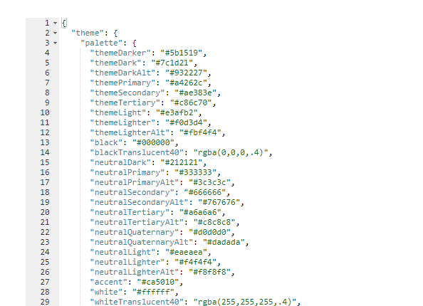
Use SharePoint contexts and theme in your templates
If you need to use current site theme colors, fonts and so on you can use the theme property available in the @root Handlebars context like this:
<content id="data-content">

        <style>
            .example-themePrimary {
                color: {{@root.theme.palette.themePrimary}};
            }
            ...
        </styles>

        ...

        <span class="example-themePrimary">{{Title}}</span>

        ...

</content>
If you want to reference the current user, you can get that from a context variable like this:
You can also use this variable in the 'Details List' and 'Cards' layouts in field expressions.
A good way to see all available context values is to switch to the debug layout and inspect the values:
Work with placeholders
To indicate the data are loading, you can create placeholders (shimmers) using the <content id="placeholder-content"> section of your HTML template:
The placeholder is only loaded during first data load. For subsequent requests, a overlay will be displayed.
<content id="placeholder-content">

    <style>

        .placeholder .icon {
            width: 20px;
            height: 16px;
            margin-right: 5px;
        }

        .placeholder ul {
            list-style: none;
        }

        .placeholder ul li {
            display: flex;
            align-items: center;
            padding: 8px;
        }

    </style>

    <div class="placeholder">
        <ul>
            {{#times 5}}
                <li>
                    <div class="icon placeholder--shimmer"></div>
                    <span class="placeholder--shimmer placeholder--line" style="width: 60%"></span>
                </li>
            {{/times}}
        </ul>
    </div>
</content>
Use CSS classes placeholder--shimmer and placeholder--line to build your placeholders. Basically, you can reuse the same HTML structure as your template content markup, but using these these classes instead to fill areas.
If no placeholder is present in the template, a default one will be loaded.
Microsoft Graph Toolkit
The Microsoft Graph Toolkit is a collection of reusable, framework-agnostic web components and helpers for accessing and working with Microsoft Graph. The components are fully functional right of out of the box, with built in providers that authenticate with and fetch data from Microsoft Graph.
In the solution, you can use Graph Tookit components without the need to re-authenticate against Microsoft Graph because the Web Parts already use the SharePoint provider.
Refer to the official documentation to see all available components. For instance, we use the Microsoft Graph Toolkit for the people layout via <mgt-person>.
Build templates with item selection
If your template requires items selection for dynamic filtering, you can follow these guidelines to design your template structure. The item selection feature is based on the Office Fluent UI Selection component and custom data attributes.
The available data attributes you can use in your HTML template are:
data-selection-index: the index of the item being represented. This would go on the root of the tile/row.data-selection-toggle: this boolean flag would be set on the element which should handle toggles.This could be a checkbox or a div.data-selection-all-toggle: this boolean flag indicates that clicking it should toggle all selection.data-selection-disabled: allows a branch of the DOM to be marked to ignore input events that alter selections.data-selection-select: allows a branch of the DOM to ensure that the current item is selected upon interaction.
As item key you must use the builtin Handlebars {{@index}} property in the {{#each}} loop. Also because state managed is internally managed by the Web Part, we provide you an Handlebars helper isItemSelected to help to apply styles depending of the selection (ex: apply a CSS class or not). To use this helper correctly, you must pass the current selected keys and current index to get the selected state for an item:
(isItemSelected @root.selectedKeys @index)
Template example with item selection
<style>

    .selected {
        background-color: {{@root.theme.palette.themeLighter}};
        border: 1px solid {{@root.theme.palette.themePrimary}};
        color: {{@root.theme.palette.themePrimary}};
    }
    ...

</style>
...
{{#each data.items as |item|}}
    <div class="{{#if (isItemSelected @root.selectedKeys @index)}}selected{{/if}}" data-is-focusable data-selection-index="{{@index}}" data-selection-toggle>
        <span>{{slot item @root.slots.Title}}</span>
    </div>
{{/each}}
Note
- If you allowed multi items selection, you must use
CTRL+Left clickto select multiple elements. You can also select a range of elements usingSHIFT+Left click.
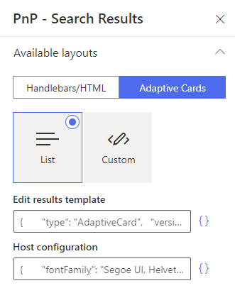
Adaptive cards customizations
As defined by Microsoft:
"Adaptive Cards are platform-agnostic snippets of UI, authored in JSON, that apps and services can openly exchange. When delivered to a specific app, the JSON is transformed into native UI that automatically adapts to its surroundings. It helps design and integrate light-weight UI for all major platforms and frameworks."
This new way of displaying data can be used in the Modern Data Visualizer solution as well.
You can use the adaptive cards builder to create your template https://www.adaptivecards.io/designer/. Adaptive cards can be used for SharePoint Search and Micrososft Search data sources.
Use web components and HTML markup in adaptive cards
Web components and HTML are supported in adaptive cards through markdown processing. To use it simply, add your HTML markup in the text property. Example:
...
{
    "type": "Column",
    "items": [
        {
            "type": "TextBlock",
            "wrap": true,
            "text": "<pnp-iconfile class='icon' data-extension='${string(jPath($data, concat('.',$root.slots['FileType']))[0])}'></pnp-iconfile>"
        }
    ],
    "width": "auto"
}
...
HTML in adaptive cards will be sanitized.
Reference a slot in a adaptive card
Since it is not possible to create custom functions with adaptive cards templates right now, slots values can only be accessed using the builtin jPath function and the following syntax:
"items": [
    {
        "type": "TextBlock",
        "wrap": true,
        "text": "${string(jPath($data, concat('.',$root.slots['<your_slot_name>']))[0])}""
    }
],
To reference a field without a slot, just use its name:
Explanation
string()is here to make sure the result of the jPath expression will always be a string. If omitted, if the slot provided (i.e. the object path) doesn't exist, it will returnnullcausing a render error. ThejPathfunction always returns an array.jPath(<data>, concat('.', $root.slots['<your_slot_name>']))where<data>is the JSON object used to resolve the slot. When looping throughitems, use the$datatoken representing the current item with properties. The expressionconcat('.', $root.slots['<your_slot_name>']))is to comply with the jPath syntax: every property path should be begin with a '.' (See the official jPath documentation).
Styling your adaptive cards
When selecting the adaptive cards mode, you can also setup styles through the host configuration.
From the official Microsoft documentation:
"HostConfig is a cross-platform configuration object that specifies how an Adaptive Card Renderer generates UI.".