Search Verticals
The 'Search Verticals' Web Part allows to conditionally render a 'Search Results' Web Part according to the selected vertical and control the visiblity of individual filters. It is a simple way to build a complete search center including multiple sources.
Configure verticals
-
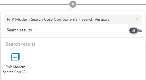
Edit the page and add a 'PnP Modern Search Core Components - Search Verticals'.


-
Configure verticals
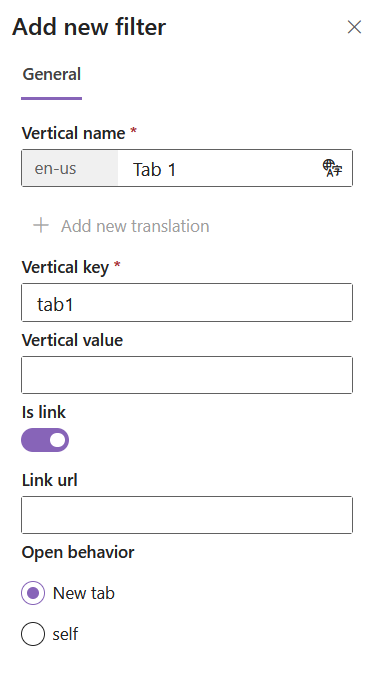
Setting Description Vertical name The name of the vertical as seen by users.You can specify a value per language according to your site language settings.
infoIf your site is configured to use multiple languages, the 'Add new translation' button will be available. Otherwise, the default language is used by default and the button is greyed out.Vertical key The vertical key associated to the tab. Useful to get the vertical valyue via the {verticals.key}token.Vertical value The vertical value associated to the tab. Useful to get the vertical value via the {verticals.key}token.Is link If enabled, the vertical will behave as a hyperlink when cliked. Link url The URL to browse when clicked. Open behavior The link open behavior. - New tab: open in a new tab of current browser.
- Self: replace the current tab.
 Tip
TipYou can change verticals order using drag n' drop in the property pane.
-
Connect the other web parts on page:
Customize templates
To know how to author templates, refer to the general guidelines.
The search verticals web part provides the following templates to be overriden:
verticals
This template controls the rendering of each vertical:
PropertiesThe following properties can be used in the template:
| Property | Description |
|---|---|
verticals | Array of verticals configured in the webpart.
|
selectedVerticalKey | The current selected vertical key. |
<template data-type="verticals">
    <div class="flex flex-row space-x-2" >
        <div
            data-for="vertical in verticals"
            data-props="{{@click: onTemplateVerticalSelected}}"
            class="border-solid border-2 w-40 h-20 rounded flex justify-end flex-col">

                <div class="text-white bg-black/60 p-2 font-bold">
                    {{vertical.displayName}}
                </div>

                <div data-if="vertical.key === selectedVerticalKey">
                    Selected
                </div>
        </div>
    </div>
</template>
To handle click event on a vertical use the following expression: data-props="{{@click: onTemplateVerticalSelected}}"