Authoring templates
Because web components behind all the Web Parts are directly derived from the Microsoft Graph Toolkit, they use the same templating capability. Therefore, you can do pretty much the same customizations as any toolkit component following the official documentation guidelines.
Unlike the PnP Modern Search solution, templates are no more based on Handlebars. It uses Microsoft Graph Toolkit template capability with plain Javascript.
Templates in Web Parts
When customizing a template, you actually override a part of the underlying web component UI, not the entire experience (for web components, this concept is called slots). The parts you can change depend on each component (i.e. Web Part) and what templates it exposes. Refer to individal Web Parts documentation to see the list of templates provided.
Template = predefined part of the UI you can override in the component
In the second configuration page of their property pane, most of the Web Parts propose multiple options:
The two base options are always available:
- ➝ Default is the native experience for the component (i.e no templates provided).
- ➝ Custom is where you can override templates for underyling components
Some Web Parts may provide more options (like 'Tiles' in the search resulst Web Part), but they are actually 'Custom' templates where templates have been overriden.
Custom templates
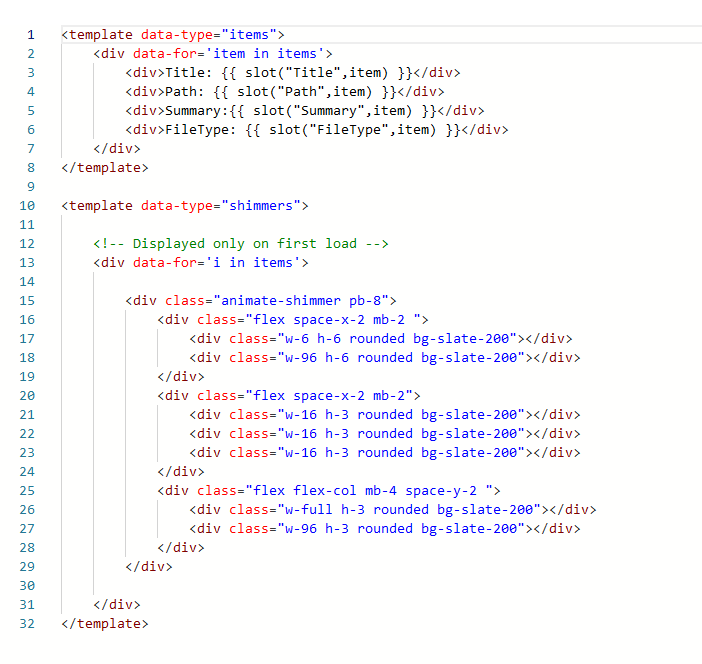
To override templates for a specific Web Part click on the Edit component template(s) text box to open the editing canvas:

The data-type attribute corresponds to the name of the template exposed by the component.
➝ You can define multiple templates at the same time.
➝ Available templates depend of the Web Part (ex: Search Results, Search Filters, Search Verticals).
Available customizations
Here are the possible customizations you can make in templates:
| Customization | Example | |
|---|---|---|
| Define you own web component templates | ❌(defined by the internal components) | |
Add <style> tags | ✔️ | warning CSS classes are global to the page. Make sure you use unique names to avoid conflicts. |
Add <script> tags | ❌(for security reasons) | |
| Use data binding | ✔️(using {{ }}) | |
| Change binding syntax | ❌(default is awlays {{ }}) | |
| Use conditional rendering | ✔️ | |
| Use loops | ✔️ | |
Use {{this}} | ✔️ | |
| Use data context helper properties | ✔️ | |
| Use custom web components | ✔️Only components starting with pnp- or mgt- | |
| Convert text from properties to HTML | ✔️ (using data-html attribute). | data-html ➝ With data-html |
Use an external file
Instead of defining the HTML code directly embbeded in the Web Part, you can link an external .html file.
The file needs to be accessible in read by users. If you store the file in a SharePoint library, make sure permissions are set correctly.
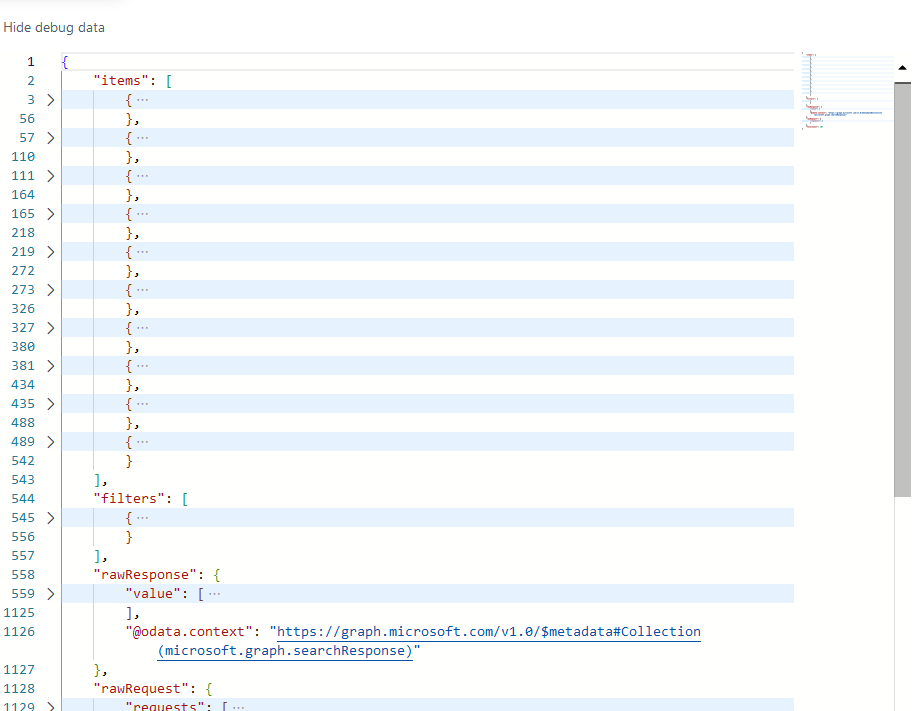
Enable debug mode
The debug mode allows to inspect underlying data returned by the Web Part. It is also useful to see available properties you can use in your templates.

Enable Microsoft Graph toolkit
<template data-type="items">
    <mgt-file-list></mgt-file-list>
</template>
When Microsoft Graph Toolkit is enabled, you don't need to add a provider as the authentication is managed automatically by the Web Part.
Use toolkit component with caution especially when used in loops as performances could significantly decrease.
Advanced concepts
Use adaptive cards in templates
It is possible to use. However, because adaptive cards rely have their own templating mechanism based on a data context to display the information, you need to use the special helper mergeContext to pass the Web Part context to the adaptive card.
The mergeContext helper mergers the item data and Web Part context (slots, layout properties) into a single JSON object so it can be used in adaptive cards.
➝ Example
Adaptive card
{
    "$schema": "http://adaptivecards.io/schemas/adaptive-card.json",
    "type": "AdaptiveCard",
    "version": "1.3",
    "body": [
        {
            "type": "Container",
            "items": [
                {
                    "type": "TextBlock",
                    "text": "${title}" // 'title' from item.title property in the search result
                }
            ]
        }
    ]
}
Usage in templates
<pnp-adaptive-card url="<url_of_the_adaptive_card>" context="{{ mergeContext(item) }}">
</pnp-adaptive-card>